Self branding
As soon as we were told about are self branding assignment I was already sure of what I wanted to specialise in. I've always had a love for typography and editorial since starting college the reason for my love for type is because i believe i can represent hidden meaning with type rather than flat imagery. I also learnt that I'm a very piratical person as i like to work with my hands, so when it comes to typography I like going outside and using objects to create type of find shape in objects.
As a young child i've travelled a few places such as Barcelona, because of this it has made me very interested in architecture so for this assignment I want to try and include type and architecture and find away to link them together.
The place i am from is quirky and quaint, so I also thought that I could communicate this idea through type and editorial to.
As a person I find that I am, a creative, jolly, outgoing and a team player, and I really want to try communicate this through the use of type.
In terms of a logo I want to create something really unique to me, rather than just my name as i feel that it's used to much. Also i feel using your name is more for someone who would like a small business and I am not that person.
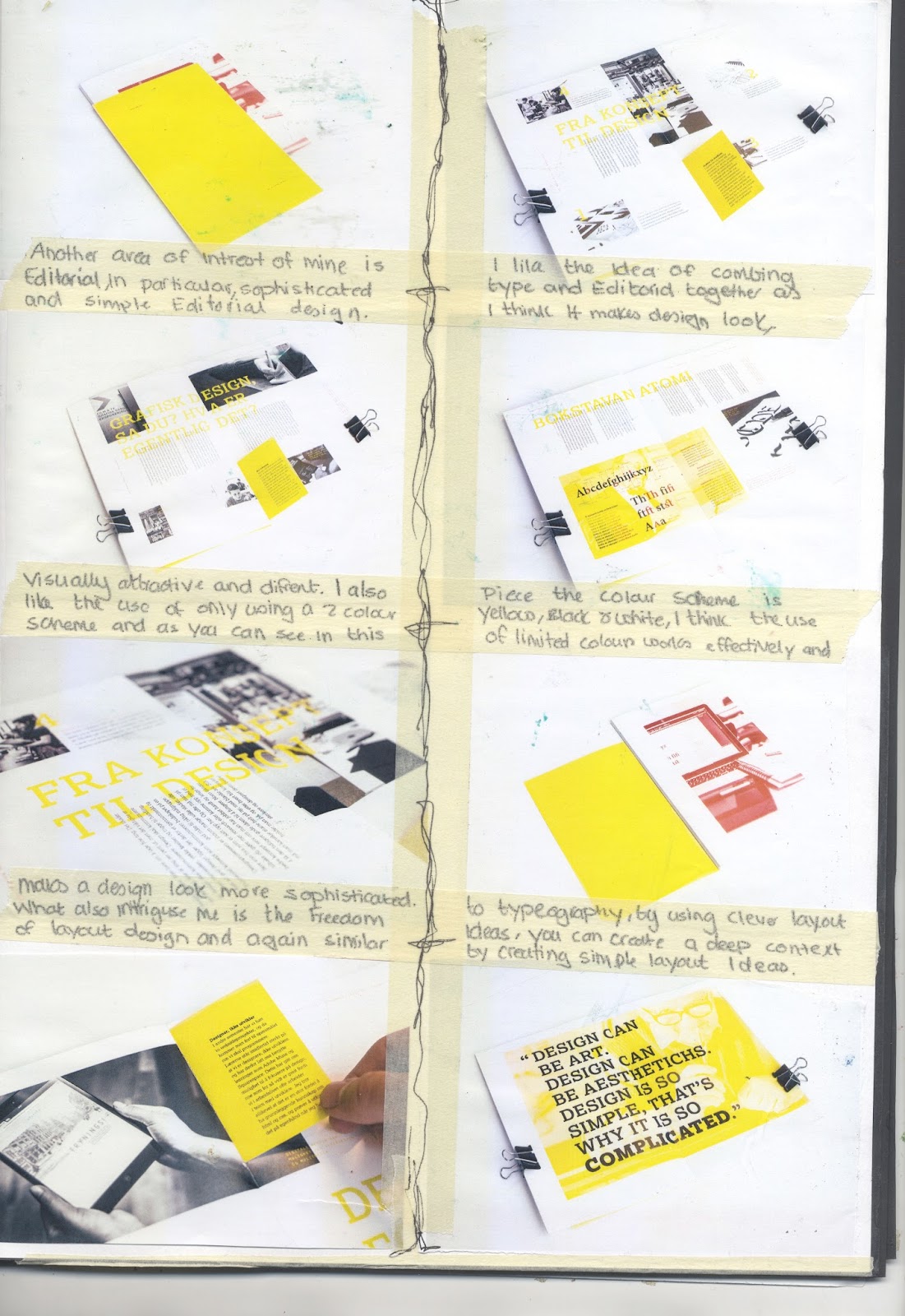
To began further research I began creating a sketch book of editorial and type that could possibly influence the work that i do. As you see this type below is scenography the reason for this choice is because I love the freedom of how scenography makes me feel, as i feel its very easy to do and looks good at the same time, yet it can communicate so much for such a simple type manipulation. I feel this method describes me in-terms of how I like music and dancing, and this type had movement in it so describes those reasons.

This is some other imagery which I collected, the choice of this was because of the editorial design, the use of the bright colours and type works really well and catches an audience's eye and looks professional with out blinding the audiences eye. This influences my ideas to use vibrant colour which will represent the ideas of myself being a happy person.
From creating my own sketch book I thought of the idea of creating a typography sketch book, because of this i then went into the library to try find something similar to my idea because of this I found this book designed my Steven Keller. This book is now my favourite type book, it contains a number of artists experimentation before making there final outcomes, it shows there design process and there way of thinking, which inspires me, with the way i think when it comes to type design. This book really helped influence me in what I wanted to do, because of this I will now be creating a typography book.


From this I then began to sketch some ideas out for a logo design which i did struggle with, I wanted to come up with something simplistic yet unique, however i didn't want to use my name as I felt that it was over used. It's here when I had the idea of the name Mango Design, the reason for this is because a while back I created an account random called Mango, and I thought It could work well as a design name. Also what i found is that the colour of a mango is warm vibrant colour, which describes my personality however further in to my research I found this quote ''The color orange is a power color.
Although the color red is associated with fiery, burning heat, orange color is softer and is more connected to the warmth of the sun.
Orange is still an active, vibrant color and associated with movement, but it does not carry with it the connection to passion and extremes that the color red does. It marries the vitality of red with the stability of endurance.
Orange color stimulates creativity. People who love orange are often curious and love exploring new things. They are thought of as sincere and thoughtful.
Edgar Cayce, in his readings, says "orange is indicative of creative expression, the spark of genius. Because it is associated with two of the lower four centers... it would be expressive of earthiness and nature." Because of this It made me confirm the idea of using the work mango to influence my design.
I also found in my research that the mango originally came from Asia, Burma, so I thought that i could somehow combine the burmese font into my logo, there for my logo would be different and have hidden meaning and be quirky at the same time.


This is the start of some of my online experimentation which i created on illustrator, i tried to create oval like shapes to almost manipulate the shape of a mango i did this by using the pen tool to create these shapes. I then messed round with different vibrant colours which describe my personality and also the colour of the mango. Altho I did like this type I felt that it looked childish there for would not work well and look professional for my-self branding.


As you can see next to the type is a foreign font, which is burmese for mango, i wanted to see what the type looked like and found that it used quite a few circular shapes like mango and immediately thought that it could work well for a logo if i manipulated so you could understand what it said.

I then began to think go some kinda of imagery that i could include in my design as i felt that it could do with some warmer colours such as this red. I created this using watercolours and then taking it on to photoshop to enhance the colours, I think that this works well and should be included in my designs, as it will brake up the eye from looking at type all the time.


This is some sketching of one of my type faces which I created, I created this type earlier in the year and felt that I could use it in my book to showcase my type design, this font also realists to where I am from as i live in a quaint and quirky village and the type pursues this vision by its old fashioned style.


I then began to come up with another type, as I wanted to include something archetextuals i said previously that I've always been interested in type design so I thought that i could combine them together.
To create this font, i used blueprints of buildings all around the world which I found interesting and traced over the buildings which came up with similar shapes to these and i then manipulated them to make them look more professional. This font works well as it uses the practical way of thinking and is completely different to any other type that I have used before,


This is the font in the orange which i created, from the burmese font on the right, a mango is originally from Burma so I thought mixing the font into the logo to create another font would be interesting and what i found is that the font is actually circular so it communicates more to the look of a mango. I did this by simplifying the font down and turning certain letters different ways round to make letters. I feel that this type works well and is one of my favourite, due to its hidden meaning and the fact that it looks professional.


I then decided that I really like the font and started mocking up posters, for some finals and I think that they work well.


I then began to crate business card designs using the type and colour orange to influence the design which I think works well again due to its simplistic design yet deep meaning.


I then also knew that I wanted to try get my work to the public eye to get noticed by designers and professionals, so when it came to applying for jobs, it will be handy to have on a cv, this site was also made so that i could collaboratively work with young designers like myself.


Overal I think my design ideas were successful due to the deep hidden meaning behind the logo and the use of the types which i created, I've enjoyed this project as it has let me be free with type. However if i were to do this again I would take more time with it and explore a number of ideas and leave myself more time to complete this assignment, time management is something that I will be working on.
This is the paper stock that I will be using for my final pieces:

No comments:
Post a Comment